Want a website that’s fast, user-friendly, and designed to convert? Framer is a game-changer for building modern websites in 2025. It’s simple to use, supports SEO, and delivers sleek, responsive designs without requiring advanced coding skills. Here’s what you need to know:
Framer speeds up websites with built-in HTTP/3, improving load times by 55%. Faster sites mean better conversions - just a 1-second delay can reduce them by 7%.
User-friendly tools make it easy to design, collaborate, and create interactive features.
Over 0.2% of the top 1 million websites now use Framer, and its popularity is growing rapidly.
This checklist covers everything from planning and designing to testing and launching a Framer website that works across devices and drives results. Let’s dive in.
Planning Your Framer Website
Taking the time to plan your website carefully can save you from unnecessary headaches and costly revisions down the line. A well-thought-out blueprint ensures your design achieves its business goals.
Set Your Website Goals and Target Audience
Your website is more than just a digital presence - it's a critical tool for driving growth.
"Your B2B website isn't just a digital brochure - it's a powerhouse for driving business growth." – Steve Soto, Partner & CTO at The Breezy Company [1]
Start by defining your SMART goals - specific, measurable, achievable, relevant, and time-bound objectives. These goals might include lead generation, sales, education, or brand awareness. While you can have multiple goals, it’s crucial to prioritize them to guide your design decisions effectively [1][2].
Next, get to know your audience. Build detailed user personas based on analytics and feedback. These personas should cover demographics, pain points, preferences, and online behavior. Understanding your audience helps you tailor your content, features, and user flows to meet their needs. For example, if your main goal is lead generation and your audience includes busy executives, your homepage should immediately communicate value and provide easy access to contact forms.
Your website needs to answer the "What's in it for me?" question within seconds of a visitor landing on your page. When your goals align with your audience's needs, creating that connection becomes seamless [1].
Plan Content and Features
Your website's success hinges on how well you plan its content. Start with the homepage - it should deliver your core message instantly, appealing to visitors' emotions without overwhelming them with excessive text [3]. Place your most critical information above the fold so visitors see it without scrolling.
Each page should serve a specific purpose. For instance:
The About page should build trust and showcase credibility.
Service or Product pages should address common questions and objections with detailed, clear information.
For e-commerce sites, include product descriptions, pricing, shipping details, and a user-friendly checkout process.
Interactive elements like contact forms, live chat, or appointment booking tools can significantly boost engagement. Offering lead magnets, such as downloadable guides or free consultations, can also capture visitors' interest [1].
Gather all necessary assets upfront - logo, brand colors, fonts, images, and videos - to ensure a consistent design and avoid delays. Establish a content hierarchy that highlights your logo, key headlines, and strong calls-to-action to guide visitors’ attention to the most important elements [3].
Build a Sitemap and Wireframe
A sitemap acts as your website's framework, showing how pages connect and providing a logical flow for both visitors and search engines [4]. Start with your main navigation categories and map out the pages under each section. This process can reveal gaps in your content or unnecessary pages before you start building.
Structure your sitemap with your audience in mind, rather than your internal organization. For instance, if you're a digital design studio, visitors are likely looking for services like SEO or web design - not your internal team structure. Test your sitemap by walking through common user paths to ensure information like pricing, contact details, or service specifics is easy to find.
Wireframing brings your sitemap to life visually. These basic layouts show where content, images, and interactive elements will appear on each page, without distractions like colors or fonts. Focus on user experience essentials: logical content flow, intuitive navigation, and strategically placed calls-to-action.
Key wireframing tips:
Ensure your logo links to the homepage and that the main menu is easy to find [3].
Plan mobile navigation with collapsible menus or layouts suited for smaller screens.
Prioritize readability with sufficient contrast, a minimum font size of 16pt, and a consistent use of two to three fonts.
Clear wireframes not only make the design process smoother but also help you get stakeholder approval early, saving time and effort later. Once your wireframes are finalized, you’ll be ready to dive into Framer’s design tools with confidence.
Designing in Framer: Best Practices
Bring your creative ideas to life in Framer by following key design principles that ensure your website looks great and works well on any device.
Responsive Design Guidelines
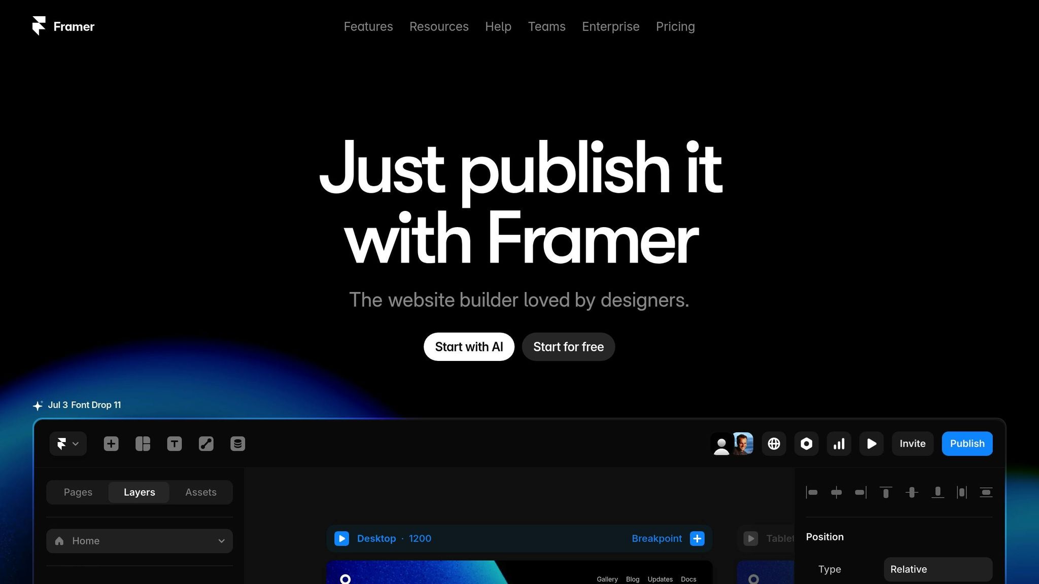
Framer uses a desktop-first approach, meaning your desktop layout serves as the base for larger screens. By default, Framer provides three breakpoints: 1200px for desktop, 810px for tablet, and 0–809px for phone [10]. However, adopting a mobile-first mindset within this framework can lead to cleaner, more focused designs.
Start by designing for smaller screens to prioritize the most important content [5]. Use Framer's built-in CSS Grid and Flexbox tools to create layouts that naturally adjust to different screen sizes [5]. Instead of fixed pixel values, opt for relative sizing - like percentages, auto, fit, or fill properties. For example, setting image widths to 100% ensures they resize according to their container, preventing issues on smaller devices [6].
Framer's stacks and frames are invaluable for responsive layouts [6]. Stacks help arrange and space components automatically, while frames provide structure. Use the 'gap' property in stack settings or set the 'Distribute' property to 'Space Between', 'Space Around', or 'Space Evenly' for consistent spacing [6].
For mobile users, touch optimization is crucial. Ensure buttons and links are at least 48×48 pixels to make them easy to tap [5]. Always test your designs on real devices to ensure they perform as expected.
Once your responsive layouts are in place, focus on maintaining a cohesive visual style across all pages.
Maintain Visual Consistency
To keep your design looking polished, use Framer's constraint system to maintain proportions and alignment as screen sizes change [8]. Constraints determine how elements behave when their container resizes, so understanding them is essential.
Use breakpoints wisely to adjust your design for different screen widths. Update fonts and text styles at each breakpoint to ensure readability [7]. Switching to relative units like percentages, ems, or rems for dimensions allows your design to adapt more fluidly than with fixed pixels [7].
On larger screens, set a maximum content width - around 1,440 pixels is ideal - to prevent text from stretching too far and becoming hard to read [7]. Navigation and footers should remain consistent across breakpoints. Use templates and layout properties to keep these elements uniform [9]. Organize content with structured frames, adding padding to 'section' and 'content' frames for better spacing [9].
Be selective with effects. Overusing them can slow down your site and overwhelm visitors. Focus on a few key effects to maintain performance and visual clarity [9].
The goal is to use as few breakpoints as possible while relying on relative measurements for flexibility [11]. Regularly preview your work on different devices to catch potential issues early [7].
Accessibility and SEO Setup
As you refine your design, don’t overlook accessibility and SEO. Ensure there’s enough contrast between text and background colors for readability [5]. Make sure all interactive elements - like buttons, links, and forms - can be navigated using the Tab key alone [5]. To boost performance, compress images before uploading them to Framer. Large image files can slow down your site, especially for mobile users [5].
Testing and Quality Assurance
Once your design is finalized, the next step is ensuring it works flawlessly. Thorough testing is essential to catch and fix any issues that could impact your website's performance or user experience.
Test Across Devices and Browsers
Your website should look and function smoothly on all devices and screen sizes. Considering that nearly 60% of web traffic in 2023 comes from mobile devices [7], mobile compatibility is a priority. Use Framer's responsive features to check how layouts, animations, and interactions adapt across various devices.
Preview your site in Framer and test it on real devices to ensure layouts adjust seamlessly and text remains legible at key breakpoints - like 1,200px for desktops, 810px for tablets, and 390px for mobile phones. If you've enabled auto-responsive text, confirm that font sizes adapt appropriately. Testing on actual devices also helps identify touch-related issues, such as buttons or links that are too small to tap comfortably. Additionally, review your site on popular browsers like Chrome, Safari, Firefox, and Edge to catch any inconsistencies in animations or interactions.
Check Navigation, Links, and Forms
Every navigation element should work as intended. Test for proper redirection, accurate labeling, and keyboard accessibility. Ensure drop-down menus display correctly and that forms enforce input rules, show error messages, and use clear labels. Use keyboard shortcuts like Tab (and Shift + Tab) to move through links and form controls, and confirm that elements can be activated with the Spacebar, Enter, or Arrow keys. Don’t forget to test the "skip navigation" link to ensure it functions properly.
For forms, verify that required fields, character limits, and format rules are enforced. Make sure error messages are clear and appear where needed, and confirm that the submission process works smoothly, including any redirections. For icon-only buttons, ensure they include text alternatives to maintain accessibility.
Review Content and User Flows
Double-check your content for clarity and structure. Replace vague link text with descriptive alternatives, and confirm that page titles are unique and marked as h1 tags. Ensure visual headings follow a logical hierarchy to make navigation easier for users.
Simulate typical user journeys to test your site's user flows. Each workflow should focus on a single goal, starting from a clear entry point and ending with a defined final step. Labels for actions, decisions, and screens should be straightforward and easy to understand. Provide feedback to users during key moments - like form submissions, loading states, or confirmation pages - to enhance their experience.
Make sure all images include alt text and verify that critical details, such as contact information and pricing, are accurate. Test your site's functionality on mobile devices to ensure it performs well on smaller screens. This is especially important since 73% of web designers believe non-responsive designs drive visitors away [12].
Once your site passes all these tests, you’ll be ready to set up analytics and performance tools to ensure a smooth launch.
Launch and Post-Launch Steps
After thorough testing, your website is finally ready to go live. This stage involves setting up tracking systems, fine-tuning performance, and ensuring a smooth launch that sets the stage for long-term success.
Set Up Analytics and Tracking
Start by implementing analytics tools to monitor how visitors interact with your site. Define clear goals and key performance indicators (KPIs) to track meaningful metrics like sign-ups, feature usage, and conversions. Tools like Google Analytics, Google Search Console, and event tracking can help you measure these KPIs effectively. Use event tagging to gather detailed insights about user behavior, including data on location, device type, and user attributes. Heatmaps and session recording tools can also provide valuable qualitative data on user interactions, helping you understand what works and where improvements are needed [16].
"User behavior tracking is the key to unlocking actionable insights about how users interact with your product or website. It reveals what's working, what's not, and where users drop off."
– Tope Longe, Growth Marketing Manager [16]
Check Performance and Speed
Website performance, especially speed, has a direct impact on user experience and search engine rankings. Research shows that websites taking longer than 10 seconds to load see a 123% increase in bounce rates [14]. To address this, use tools like Google PageSpeed Insights, GTmetrix, and Pingdom to identify areas that need improvement.
Pay particular attention to image optimization. Keep image file sizes under 500 KB and choose the right format for each type of content - for example, use JPG for photos, PNG for graphics with text or sharp edges, and SVG for logos or icons. While tools like Framer automatically optimize images, preparing them properly before uploading can significantly enhance performance. For instance, one website reduced its load time from 60 seconds to just 544 milliseconds by resizing images [14].
For videos, keep file sizes under 5 MB, compress them before uploading, or embed them from platforms like YouTube or Vimeo [15]. When using PageSpeed Insights, run multiple tests and take the median score, as results can vary. Keep in mind that while these scores are helpful, Core Web Vitals are the metrics that truly influence SEO [13].
Once your performance is optimized, move on to a final user-experience review.
Final Review and Launch
Before launching, conduct a thorough review of your site’s functionality, content, and performance. Make sure all features work as expected, content is accurate, and performance is fully optimized. Eliminating any warnings before publishing can improve both user experience and SEO [13].
Test your site across multiple devices to ensure everything - from forms to links - works seamlessly. Double-check that contact information is consistent and accurate throughout the site. Verify that analytics events are being recorded correctly and that your Google Search Console is properly connected with an updated sitemap submitted for indexing.
After launching, monitor your site closely for the first 24–48 hours to catch any potential issues and confirm that all integrations are functioning properly.
Post-launch, the key to success lies in regular updates and improvements based on user behavior and feedback [18]. Keep an eye on your site’s health by checking loading speeds, fixing broken links, and addressing any other issues that arise [17]. Use A/B testing and ongoing analysis to make sure your Framer website evolves alongside your business needs.
At Striking Alchemy, we focus not only on delivering a smooth launch but also on ensuring your website stays ahead of the curve. By monitoring performance and gathering user feedback, we help refine and enhance your site to keep it future-ready.
Conclusion: Building a Future-Ready Website with Framer
Creating a website with Framer in 2025 positions your business for long-term success in the ever-changing digital world. Unlike older website builders that require constant maintenance, Framer offers a low-maintenance solution that keeps pace with evolving web standards and user needs.
Framer’s design ensures fast load times, smooth performance across devices, and scalability for future growth - giving you a strong digital foundation without the hassle of expensive rebuilds or migrations. This level of efficiency directly translates into measurable performance improvements.
If transitioning feels daunting, you're not alone. At Striking Alchemy studio, we specialize in helping businesses move from outdated platforms to Framer’s modern framework. We've seen the results firsthand. For example, Formula Bot achieved 75% faster load times and climbed in Google rankings after making the switch to Framer [19]. These kinds of improvements make the shift worthwhile.
Whether you're starting from scratch or migrating an existing site, every step you take builds toward a website that’s polished, professional, and results-driven. With the right approach, your site won’t just look great - it will perform and grow alongside your business.
The digital world is evolving faster than ever, but with Framer’s advanced platform and expert guidance, your website can stay ahead of the curve. A well-executed Framer website enhances user experience, boosts search rankings, and drives meaningful business growth.
Ready to take the next step? Reach out to Striking Alchemy for a free audit and migration strategy, and let’s build a website that’s ready for the future.
FAQs
How does using HTTP/3 in Framer make websites load faster, and why does this matter for driving conversions?
Framer uses HTTP/3 to enhance website load speeds by optimizing data transfer methods. With features like faster multiplexing and reduced latency, it delivers a smoother and quicker browsing experience.
Quick load times are essential for boosting conversions. They lower bounce rates, improve user satisfaction, and keep visitors engaged - especially on mobile devices, where even small delays can drive users away. A fast-loading site not only holds visitors' attention but also encourages them to explore further, interact more, and eventually turn into customers.
How can I optimize my Framer website for SEO and accessibility in 2025?
To make your Framer website perform well in SEO and remain user-friendly for everyone, focus on a few critical areas. Start with proper HTML structure - this means using meta titles, descriptions, and adding alt text to your images. These steps not only improve your site's search visibility but also make it accessible to a broader audience.
Speed is another big factor. Aim for fast page load times, adopt a mobile-first design, and ensure your navigation is simple and intuitive. These elements keep users engaged and can positively impact your search rankings.
For accessibility, include ARIA labels, optimize images so they work seamlessly with screen readers, and limit external embeds to keep loading times in check. On the SEO side, structured data and internal links can help search engines better understand your content. By combining these strategies, you'll create a site that's easy to find, easy to use, and welcoming to all visitors.
How do I keep my Framer website updated to meet modern web standards and user needs?
To keep your Framer website in tune with current web standards and what users expect, it’s essential to prioritize regular updates. This means refining both its functionality and design - think smooth user experiences, quick load times, and seamless mobile responsiveness.
Teaming up with a studio that specializes in Framer websites can be a game-changer. These experts can ensure your site stays fresh with modern design techniques, user-friendly navigation, and compelling storytelling. Plus, they’ll help make sure your website remains easy to update and ready for the future. A well-maintained site doesn’t just look good - it keeps visitors engaged and boosts conversions.