Your website can be your best sales tool - if it’s optimized correctly. Boosting conversions by just 10% doesn’t require a complete overhaul. Instead, focus on these five proven strategies to make your site more effective:
Optimize Call-to-Action (CTA) Buttons: Use clear text, contrasting colors, and strategic placements like above-the-fold or mid-content. Test designs and placements to see what works best.
Improve Website Speed: Slow loading times drive visitors away. Use tools like GTmetrix or PageSpeed Insights to identify and fix performance issues.
Simplify Navigation: Make your website intuitive by using clear menus, reducing form fields, and gathering user feedback to fix problem areas.
Leverage Framer: Build a high-performing site with Framer’s tools like real-time editing, animations, and mobile responsiveness.
Prioritize Mobile Optimization: Ensure your site is easy to navigate on phones with thumb-friendly buttons, fast load times, and streamlined forms.
Even small adjustments - like better CTAs or faster load speeds - can have a big impact. These actionable tips can help you convert more visitors into customers without spending extra on driving traffic.
1. Improve Call-to-Action Button Placement and Design
Call-to-action (CTA) buttons are the bridge between user interest and action. A well-crafted CTA doesn’t just sit on the page - it guides users naturally toward their next step. The difference between a button that gets clicked and one that’s ignored often boils down to three things: placement, design, and timing.
Make sure your primary CTA button grabs attention. Use contrasting colors, plenty of white space, and text that’s easy to read across all devices.
Colors can evoke emotions or set the tone. For example:
Red or orange can create urgency.
Green suggests progress or success.
Blue builds trust.
The key is contrast - your CTA should stand out from the rest of the page design.
For mobile users, ensure buttons are large enough to tap easily. Rounded corners can make the button feel approachable, while sharp edges might convey a more professional or direct vibe. And don’t forget the text! Use clear, actionable phrases like "Start My Free Trial," "Download the Guide," or "Get My Quote Now."
A/B Testing Your CTA Performance
Testing is essential to figure out what works best. Use tools like Google Optimize, Optimizely, or VWO to test one variable at a time, whether it’s the button color, text, or size. Run these tests over a complete business cycle to gather meaningful insights.
Start with high-impact changes. Small tweaks - like adjusting the color or rephrasing the text - can lead to noticeable improvements in conversion rates. You can also experiment with different value propositions in your CTA copy to see which resonates most with your audience.
Don’t stop at the main CTA. Secondary buttons, exit-intent pop-ups, and footer CTAs are also worth optimizing. Even small gains in these areas can add up to a big difference in overall conversions.
Where to Place Your CTAs for Best Results
Placement is just as important as design. The goal is to position CTAs where users naturally encounter them - without feeling overwhelmed. Offer multiple opportunities to engage, but keep the experience seamless and intuitive.
Above the Fold: Perfect for quick actions like newsletter signups or free downloads. This placement grabs attention right away.
Header Navigation: A persistent CTA in the header keeps it visible as users scroll, acting as a constant reminder. Keep the text short to avoid cluttering the navigation.
Mid-Content: Ideal for longer pages where you’re explaining key benefits or solutions. A mid-content CTA provides a natural pause for users to take action.
End of Content: After presenting all the details, an end-of-content CTA can nudge engaged readers to make a decision.
Exit-Intent Popups: If a visitor is about to leave, an exit-intent popup offers one last chance to engage. Just make sure it’s eye-catching but not annoying.
Here’s a quick look at common CTA placements and their strengths:
CTA Placement | Best For | Considerations |
|---|---|---|
Header/Navigation | Quick actions from ready-to-buy visitors | Always visible but should remain concise |
Above the Fold | Immediate actions like signups/downloads | Grabs attention early without waiting for scroll |
Mid-Content | Readers engaging with detailed content | Natural pause for action after key points |
End of Content | Users ready to decide after reading | A final opportunity to convert |
Exit-Intent Popup | Visitors about to leave | Last chance to engage; keep it compelling |
Sidebar | Supplemental content areas | Consistent presence without dominating the page |
The best strategy? Use multiple placements. A header CTA might catch visitors ready to act immediately, while a footer CTA can convert those who prefer to explore all the details first. By spreading CTAs across different touchpoints, you create opportunities for engagement at every stage of the user journey.
2. Speed Up Your Website Loading Times
A slow website can frustrate visitors and hurt your conversion rates. Users, especially those on mobile devices with varying network speeds, expect a fast and seamless experience. To ensure your site meets these expectations, focus on making it quick and responsive. Here’s how you can get started.
How to Make Your Website Load Faster
Start by measuring your website's performance using tools like GTmetrix, PageSpeed Insights, Pingdom, WebPageTest, and DebugBear. These tools can pinpoint the areas where your site is lagging and help you identify specific issues that need fixing[1][2][3][4][5].
Keep an eye on Core Web Vitals - key metrics that Google uses to assess user experience:
Largest Contentful Paint (LCP): Measures loading speed.
Total Blocking Time (TBT): Evaluates how responsive your site is.
Cumulative Layout Shift (CLS): Tracks visual stability to ensure elements don’t unexpectedly shift while loading[1][2][3][4][5].
3. Make Your Website Easier to Use
The way users experience your website has a direct effect on your conversion rates. A site that's easy to navigate invites users to stay and take action, while a confusing or cluttered design can send potential customers elsewhere before they even get to your offer.
People visit your site with specific goals in mind. Your job? Make it as simple as possible for them to achieve those goals.
How to Get User Feedback for Better Design
Improving your website’s usability starts with understanding how real users interact with it. One way to gather this insight is by asking for feedback through short surveys on key pages, like your checkout or contact pages. Keep these surveys quick and focused - questions like, “What could we do to make this page easier to use?” can provide actionable insights.
Tools like Hotjar and Crazy Egg can also come in handy. Their heatmaps show where users click, scroll, and linger, helping you identify what grabs attention and what gets ignored. For instance, you might discover that users are clicking on elements they think are buttons or failing to notice your main call-to-action because it’s buried too far down the page.
User testing is another valuable method. Platforms like UserTesting.com allow you to watch how people navigate your site in real-time. Even a few sessions can reveal glaring issues, like a confusing checkout process or unclear navigation.
Exit-intent surveys are another great way to capture feedback. When users are about to leave your site, ask them quick questions such as, “What stopped you from completing your purchase?” or “What were you looking for that you couldn’t find?” These answers often uncover key pain points that need fixing.
Once you’ve gathered this feedback, use it to make meaningful changes that improve the user experience - and, in turn, your conversion rates.
Design Changes That Boost Conversions
Start with your navigation. Your main menu should use clear, familiar terms that resonate with your audience. Avoid overwhelming users with too many options - keep it simple and intuitive.
Simplify your forms, too. The more fields you include, the less likely people are to complete them. For email signups, ask for just an email address. For contact forms, stick to essentials like name, email, and a brief message. You can always collect more details later.
User feedback can also help you refine your visual hierarchy. Make sure the most important elements - like your headline, benefits, and call-to-action - stand out. Use larger fonts for key text, bold for emphasis, and plenty of white space to keep the page clean and readable.
Consistency is another key factor. Uniform button styles, colors, and layouts across your site build trust and make navigation easier. When users know what to expect, they’re more likely to explore other sections of your site.
Don’t forget to address errors clearly. If a user enters an invalid email address, for example, provide a clear message explaining the mistake and how to fix it. Real-time validation for form fields can make this process even smoother.
Finally, trust signals can make a big difference. Features like customer testimonials, security badges, and visible contact information help put users at ease. Place these elements strategically near your call-to-action buttons to encourage decision-making.
4. Use Framer to Build High-Converting Websites
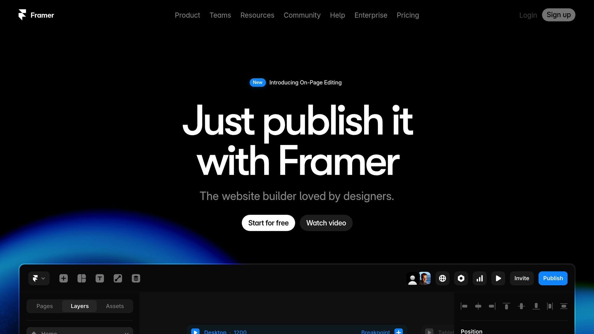
When it comes to creating a website that drives conversions, the platform you choose plays a huge role. A high-performing site requires more than just great content - it needs a solid foundation. Framer offers a suite of tools designed to help small businesses build websites that are not only visually appealing but also optimized to turn visitors into customers, even if you’re not a tech expert.
Framer stands out because it combines flexibility with ease of use. Its real-time editing tools let you make changes and see the results instantly. This makes it simple to experiment with different layouts, headlines, and calls-to-action (CTAs) to see what resonates best with your audience.
The platform also shines with its animations and micro-interactions, which naturally guide users toward key actions. For example, a subtle hover effect on a "Sign Up" button or a smooth animation revealing your pricing options can keep users engaged and nudge them toward conversion. These small touches can make a big difference in how visitors interact with your site.
Another standout feature is Framer’s responsive design capabilities, which ensure your website looks and works flawlessly on any device. With mobile traffic continuing to dominate, having a site that adapts seamlessly to different screen sizes is no longer optional - it’s a must if you want to maintain strong conversion rates across all platforms.
If your current website is underperforming, switching to Framer can significantly improve speed and functionality without compromising your existing content or search rankings. Companies like Striking Alchemy specialize in helping businesses migrate to Framer, making the transition smooth and hassle-free.
Top Framer Features for Driving Conversions
Framer’s features are specifically designed to create websites that don’t just look good - they deliver results. Here’s a closer look at some of its most powerful tools:
Component System: Build reusable elements like buttons, forms, and testimonials to keep your site consistent and professional. Consistency builds trust, which is essential for conversions.
Interactive Prototyping: Map out user flows and test how visitors will navigate your site before it goes live. This helps you identify and fix any potential roadblocks that could hurt conversions.
Built-in Analytics Integration: Track how your pages and elements perform. This data is invaluable for optimizing your CTAs and other key features.
Framer Feature | Conversion Benefit | Best Use Case |
|---|---|---|
Real-time Editing | Test changes instantly without downtime | A/B testing headlines and CTAs |
Custom Animations | Direct user focus to important elements | Highlighting special offers or products |
Component System | Ensure consistent branding and functionality | Uniform buttons and forms across pages |
Mobile Responsiveness | Deliver a seamless experience on all devices | E-commerce checkout processes |
Fast Loading | Reduce bounce rates and improve user experience | Landing pages for paid advertising |
Interactive Elements | Boost engagement and time spent on-site | Product demos and service explanations |
Framer also supports your SEO efforts, which is crucial for driving traffic to your site in the first place. The platform generates clean, fast-loading code that search engines favor, and it gives you control over key SEO elements like meta descriptions and title tags. This ensures your site is not only conversion-ready but also easy for potential customers to find.
For small businesses aiming to build professional, high-performing websites without the headaches of traditional platforms, Framer offers a straightforward and effective solution. Its tools are designed to complement your overall conversion strategy, ensuring every element on your site works toward delivering results. From stunning design to seamless functionality, Framer has you covered.
5. Make Your Website Work Better on Mobile Devices
In the U.S., mobile traffic is a major player, and if your site struggles on smartphones or tablets, you're likely losing customers every single day. Optimizing for mobile isn’t just about shrinking your site to fit smaller screens - it’s about creating a seamless, action-driven experience tailored to how people use their devices.
A mobile-friendly site adjusts to smaller screens, but a mobile-optimized site goes further. It considers how users interact on mobile: thumb-friendly navigation, fast loading on cellular networks, and checkout processes that don’t feel like a chore.
A clunky, slow mobile site can push visitors away. The good news? You don’t need a complete redesign. By focusing on speed, simplicity, and usability, you can improve conversions significantly.
Mobile Design Tips That Work
The key to mobile optimization is removing friction for users. Here are some actionable tips to improve your mobile site:
Make buttons easy to tap: Ensure buttons are large enough and spaced out to avoid frustrating misclicks.
Simplify navigation: While hamburger menus are common, make sure your key pages are easy to find. Adding a sticky header with a clear call-to-action can drive more clicks.
Streamline forms: Reduce the number of fields in forms, break them into steps if needed, and enable auto-fill or social login options to save users time.
Optimize the checkout process: For e-commerce sites, include payment methods like digital wallets to make purchases faster and easier.
Boost page load speed: Compress images and other assets to ensure your site loads quickly, even on slower mobile networks.
Design for visibility: Use larger fonts, plenty of white space, and a clear hierarchy to make key information and calls-to-action stand out.
When designing for touch, leave enough space between interactive elements to prevent accidental taps. Replace hover effects with clear feedback for taps, and use natural swipe gestures for image galleries or carousels.
Desktop vs. Mobile Conversion Considerations
Mobile users behave differently than desktop users, so your conversion strategy should reflect that. Mobile visitors need clear, easy-to-act-on calls-to-action. Features like click-to-call buttons or prominently displayed contact information can make a big difference.
For local businesses, having essential details - like your address, hours, and phone number - front and center on mobile devices is a must. Adding location-specific features like "Get Directions" or "Call Now" buttons can make it even easier for users to connect with you.
Conclusion: Get 10% More Conversions with These 5 Methods
Every tweak you make to your website enhances its potential as a sales-driving machine.
The good news? Boosting your conversion rate by 10% doesn’t require a massive overhaul or a big budget. These five methods come together to streamline the user experience and encourage action.
By addressing common barriers, you can make a big impact. Speeding up your site keeps visitors engaged. Well-placed, thoughtfully designed CTAs encourage clicks. Mobile optimization ensures you don’t miss out on the ever-growing number of mobile users. When combined, these changes create a frictionless experience that guides users toward conversion.
Even small improvements - like faster load times or better mobile functionality - can help you surpass that 10% goal. Many small businesses across the U.S. have seen measurable gains by consistently applying just a few of these strategies.
The platform you choose also plays a key role in how easily you can implement these changes. Framer, for instance, offers tools like responsive design and fast loading speeds, making it easier to optimize your site without technical headaches.
At Striking Alchemy, we specialize in building high-converting websites with Framer. Based in Pittsburgh, we help businesses transition from outdated platforms to modern, low-maintenance sites that deliver real results. Whether you’re ready for a full redesign or just looking to fine-tune your current site, we’re here to help you see measurable growth.
Your website should be as hardworking as you are - put these strategies into action and watch your conversions climb.
FAQs
What’s the best way to test different CTA button designs to boost website conversions?
To test CTA button designs effectively, focus on adjusting just one element at a time - whether it's the button's color, text, size, or placement. This approach helps pinpoint exactly which change has the biggest impact on conversions.
Leverage A/B testing by creating two webpage versions with a single variation, then measure performance using clear metrics like click-through rates or completed actions. Start with mobile testing, as mobile responsiveness is key to user engagement and conversions. Keep your process straightforward and driven by data to discover what works best for your audience.
How can I make sure my website loads faster on mobile devices?
To make your website faster on mobile devices, start by compressing images and videos. This reduces file sizes while keeping the quality intact. Focus on a mobile-friendly design that emphasizes simplicity and quick loading. Another key step is to minify your code - remove extra characters, spaces, and comments that aren't necessary. Pair this with a reliable content delivery network (CDN) to ensure your content is distributed quickly and efficiently.
You can also cut down on HTTP requests by combining files, like CSS and JavaScript, when possible. Finally, optimize the loading order of your site’s elements to prioritize what users see first. These adjustments will create a faster, more seamless experience for mobile users, boosting both speed and satisfaction.
How can using Framer help improve my website's conversion rate compared to traditional design tools?
Framer is a powerful tool for improving your website's conversion rates by focusing on speed, interactivity, and user experience. Since it's built on React, it delivers faster load times and seamless interactions - key factors in keeping visitors engaged and encouraging them to take action.
What sets Framer apart is its pre-built components and modular design. These features make it simple to test and tweak your site in no time. You can quickly make data-backed adjustments, leading to noticeable improvements in performance and stronger connections with your audience.