If your ecommerce store isn’t converting, it’s not just bad luck - it’s bad setup. A slow site, confusing product pages, or a clunky checkout process can quietly drain thousands of dollars every month. The good news? Fixing these doesn’t take a full rebuild. Small, targeted changes in the first 30 days can deliver serious results.
In short: Start with site speed. A 1-second delay can cut conversions in half. Then fix your product pages, streamline checkout, and add trust signals like reviews and clear contact info. These four steps address the biggest reasons shoppers leave without buying.
You’ll learn how to cut load times, make product pages irresistible, and stop losing sales at checkout. This guide is for anyone running an underperforming ecommerce store who’s ready to turn visitors into customers - fast.
Here’s how to make it happen.
30-Day Ecommerce Store Optimization Timeline with Key Metrics
Quick Answer: What to Fix First
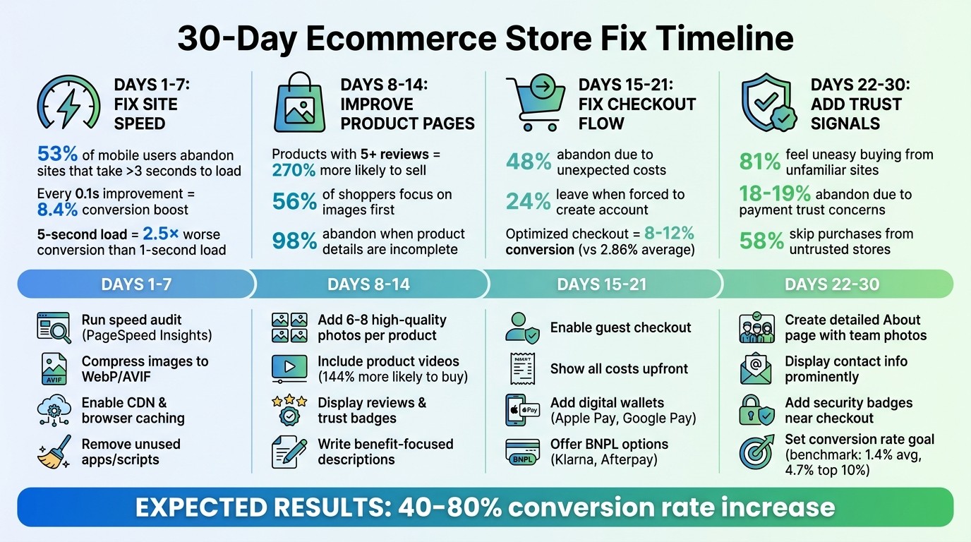
If your ecommerce store is underperforming, you don’t need to guess where to start. In the first 30 days, focus on four critical areas: site speed, product pages, checkout flow, and trust signals. These aren’t random - they directly address the biggest conversion obstacles that are draining your revenue. Here’s how each area impacts your bottom line.
A slow-loading page is a dealbreaker. A site that takes 5 seconds to load instead of 1 converts 2.5 times worse. That’s the difference between a 3.05% conversion rate and just 1.08% [7]. On mobile, where 60–70% of your traffic likely comes from, 53% of visitors will abandon your site if it takes longer than 3 seconds to load [5][6]. Before shoppers even see your products, slow speeds are pushing them away.
Next up are your product pages - the make-or-break moment for purchases. Products with five reviews are 270% more likely to sell than those with none [7]. Photos matter even more: 56% of shoppers focus on images, and 98% abandon purchases when product details are incomplete [7][8]. If your images are blurry or your descriptions leave questions unanswered, potential buyers will head elsewhere.
The checkout process is where intent meets friction. Shoppers who’ve added items to their cart are ready to buy - until something stops them. 48% abandon carts due to unexpected costs, like shipping or taxes, and 24% leave when forced to create an account [9]. The average ecommerce checkout converts at 2.86%, but with an optimized process, you could hit 8–12% conversion rates [9]. That’s up to 4× more revenue from the same traffic.
Finally, trust signals seal the deal. Security badges, clear contact details, and a relatable About page ease buyer hesitation. Without them, even interested shoppers might walk away.
Days 1–7: Fix Site Speed
Your first week is all about speed because it’s the one fix that affects everything else. A slow site doesn’t just annoy visitors - it drives them away before they even see your products. 53% of mobile users leave a site that takes more than 3 seconds to load [10][12]. That’s not just a bounce - it’s lost revenue. Start by auditing your site’s speed to find the biggest issues.
Speed also determines whether Google even shows your store. Core Web Vitals - Largest Contentful Paint (LCP), Interaction to Next Paint (INP), and Cumulative Layout Shift (CLS) - are official ranking factors [10]. In competitive ecommerce spaces, where products and content are often similar, faster sites win [5][12]. And since Google uses mobile-first indexing, your mobile performance is what really counts [12].
The payoff? It’s huge. Every 0.1-second improvement in mobile load time can boost retail conversions by up to 8.4% [12]. Vodafone improved their LCP by 31%, which led to an 8% increase in sales and a 15% jump in their lead-to-visit rate [12]. Carpe, a Shopify store, cut their LCP by 52% and saw a 5% rise in conversions and 15% revenue growth [5]. These aren’t small wins - they’re the difference between a store that struggles and one that thrives.
Run a Site Speed Audit
Start with a speed audit to identify what’s holding your site back. Google PageSpeed Insights is free, measures what Google actually cares about, and provides both "Lab Data" (simulated tests) and "Field Data" (real user experiences from the Chrome User Experience Report) [14][12]. Field data matters most - it reflects what your shoppers experienced over the last 28 days.
Test three key pages: your homepage, your most-visited product page, and your top category page [5][15]. Focus on mobile first - over 70% of ecommerce traffic comes from mobile, and performance tends to be worse due to slower devices and networks [5][15]. Aim for these benchmarks: LCP ≤ 2.5 seconds, INP ≤ 200 milliseconds, CLS ≤ 0.1 [5]. If you’re missing these targets, you’re losing sales.
For more detail, use GTmetrix’s waterfall view to pinpoint loading bottlenecks like slow images or scripts [15][12]. If you need to simulate specific conditions, like testing from a U.S. location or slower connection speeds, WebPageTest is another great tool [12]. Always test on a mid-range Android device to reflect the real-world experience - high-end developer machines don’t capture the challenges your customers face [5][15].
Apply Speed Improvements
Once you’ve identified the issues, it’s time to fix them. Compress your images by converting them to WebP or AVIF formats - these are 25–50% smaller than JPEGs without losing quality. Avoid lazy-loading critical images like your hero or product photos. Instead, use fetchpriority="high" and loading="eager" to improve LCP [5][13]. Lazy-loading above-the-fold images is a common mistake that hurts performance.
Enable browser caching so returning visitors don’t have to re-download the same assets. Add a Content Delivery Network (CDN) to serve files from servers closer to your customers, cutting Time to First Byte (TTFB) [5][13]. If you’re on shared hosting, consider upgrading to managed or cloud hosting, which can reduce TTFB from 1–2 seconds to 200–300 milliseconds [10][11].
Audit your third-party scripts and apps. There’s a clear link between too many third-party services and slower load times. Stores with 21–30 third-party services have a median mobile performance score of 44, while those with 0–5 services score 74 [5][12]. Remove anything you haven’t used in the last 90 days. Every script you eliminate is one less thing slowing your site down [5].
Take Sarah, the founder of "Artisan Bloom." In March 2026, her site had a 9.2-second load time and a 0.8% conversion rate. By switching to WebP images, adding a CDN, cutting redundant Shopify apps, and moving to managed hosting, she reduced load time to 2.1 seconds. The result? A 212% increase in conversions (to 2.5%) and a 45% drop in bounce rate within 30 days [11].
If you’ve done all this and your site is still slow, it might be time for a bigger change.
Switch to a Faster Platform
Sometimes, the platform itself is the problem. WordPress, Wix, and Squarespace rely heavily on plugins and third-party apps, which add scripts that slow your site down and create long-term technical debt [2][12]. The median Shopify store scores just 47 on mobile performance - far below Google’s "good" threshold of 90+ [5]. About 50% of mobile sites fail the Core Web Vitals assessment, meaning a fast site can outrank half the competition [5][12].
Migrating to Framer eliminates plugin bloat and other structural issues. Framer handles image compression, minification, and CDN distribution automatically, so you’re not stuck managing it yourself [12]. It also ensures key content is loaded directly in the HTML, not added later via JavaScript, which improves LCP [13]. Buttons like "Add to Cart" respond in under 200 milliseconds, meeting INP standards [5][12].
"Speed degrades gradually. Each new app adds a little more JavaScript... until the numbers start moving in the wrong direction." - Jakub Rusniok, Founder, EcomHint [5]
Rakuten 24 improved their Core Web Vitals and saw a 33% boost in conversions and a 53% jump in revenue per visitor [12]. Trendyol cut their mobile INP by nearly 50%, improving click-through rates from product listings by 1% [5]. These aren’t minor tweaks - they’re results from fixing the structural issues that older platforms create.
If you’re stuck on WordPress, Squarespace, or Wix, we can handle the full migration to Framer for you. No downtime, no hassle. You’ll get a faster site, no plugin headaches, and no maintenance treadmill. It’s a permanent fix.
Days 8–14: Improve Product Pages
Once your site loads quickly, it's time to focus on your product pages. These pages are where shoppers decide to buy - or leave. Over half of shoppers (56%) look at product images first [7], and 93% say how a product looks is the top factor in their decision [16]. If your photos are unclear, descriptions leave questions unanswered, or pricing hides extra costs, you're losing customers who were ready to buy. After addressing speed, refining your product pages can significantly boost conversions.
The stakes are high. Nearly all shoppers (98%) will abandon a site if product details are lacking [8], and 71% of returns happen because the product didn’t match its description [7]. Missing details aren’t just frustrating - they’re deal-breakers. The solution? Make your product details crystal clear, build trust, and make your offerings stand out.
Upgrade Product Photos and Descriptions
Clear, high-quality images sell. Each product should have 6–8 photos showing different angles, lifestyle shots, and close-ups to highlight texture and quality [16][17]. Include zoom functionality so customers can inspect details, and add a short video (15–30 seconds). Shoppers who watch product videos are 144% more likely to buy [7].
To keep your site fast, compress images using formats like WebP or AVIF. With 73% of ecommerce traffic coming from mobile [16], make sure images look great on smaller screens and are easy to navigate.
Descriptions matter just as much as images. Focus on benefits, not just features. For example, instead of saying "100% organic cotton", try "Soft enough to sleep in, won’t shrink in the wash" [7]. Use bullet points - 90% of products see better performance when key details are presented this way [8]. Include size charts, care instructions, and shipping details right on the page. Since 48% of cart abandonments happen because of surprise costs [7], be upfront about shipping fees and delivery timelines.
Take inspiration from brands like Ariat, which added product videos and saw a 160% higher conversion rate for viewers [7]. JustThrive simplified their product descriptions and variants, leading to an 85% increase in subscriptions and a 54.77% jump in total revenue [7]. These aren’t just aesthetic tweaks - they turn browsers into buyers.
Next, build trust by showcasing reviews and trust badges.
Add Reviews and Trust Badges
Reviews are essential for credibility. Products with at least five reviews convert 270% better than those without [7][16]. For items over $100, that number jumps to 380% [16]. Display star ratings, review counts, and a "Verified Buyer" badge near the product title - this alone can boost purchase likelihood by 15% [7].
Don’t shy away from negative reviews. Shoppers trust ratings between 4.0 and 4.7 stars more than a perfect 5.0, which can seem fake [7]. Encourage customers to leave photo or video reviews; these can increase conversions by 21–29% [16]. A strategically placed quote near the "Add to Cart" button can also reinforce trust right when it matters.
Trust badges, like SSL certifications or money-back guarantees, should be placed near the "Add to Cart" button but kept to 3–4 total [17]. Highlight your return policy and shipping costs directly on the product page - 81% of shoppers are more likely to buy when returns are easy [7], and 17% of cart abandonments stem from security concerns [16].
"Purchase likelihood peaks at 4.0 to 4.7 stars, then drops as ratings approach 5.0. Consumers don't trust perfection." - Randy Wattilete, Founder, Kirro [7]
Finally, compare your product pages to competitors to identify areas for improvement.
Compare Your Product Details to Competitors
Study how your competitors present their products. Look at their titles, descriptions, and pricing strategies. Use a title formula like: [Brand] + [Product Name] + [Key Feature] + [Variant] [16]. Keep titles under 60 characters to ensure they display well in search results and on mobile. Emphasize what sets your product apart - whether it’s free shipping, premium materials, or an unbeatable guarantee. If competitors hide shipping costs, make yours clear. If they use stock photos, showcase real customer images instead.
The goal isn’t to copy but to stand out. If your competitors don’t feature reviews, add them. If they skip size guides, create one. Every extra detail you provide gives shoppers one more reason to choose your product over theirs.
Days 15–21: Fix the Checkout Flow
Your site’s pages are faster, and your product details are clear - now it’s time to tackle checkout friction. This is where many sales slip through the cracks. Nearly half of shoppers (48%) abandon their carts because of unexpected costs, and another 24–26% leave when forced to create an account [19][18]. These hurdles are costly but can often be fixed in just a week with a few focused changes.
Allow Guest Checkout
Making shoppers create an account before buying is a surefire way to lose sales. Here's the reality: 43% of consumers prefer guest checkout, and 72% will still use it even if they already have an account [21][22]. Forcing account creation adds unnecessary steps, which feels like a chore. Instead, make guest checkout the default and let returning customers sign in as a secondary option. Only ask for the essentials - name, address, and email - so you can send cart abandonment reminders if needed.
This simple shift can reduce abandonment rates by 20–30% [9]. Want to encourage account creation without risking the sale? Prompt shoppers to register after they’ve completed their purchase. Post-purchase registration converts 65–80% of guest shoppers into account holders. For instance, in 2025, ASOS moved account creation to the "Thank You" page and saw a 50% boost in conversion rates [20].
"Shoppers want to buy something, not join a loyalty program. Creating a password, confirming an email, and remembering yet another account feels like a tax on purchasing." - Zerocart AI [9]
If account creation feels like a roadblock, it’s time to remove it.
Show All Costs Upfront
Nothing kills a sale faster than surprise fees. Between 16–21% of shoppers abandon checkout when they can’t see the total cost upfront. Hidden costs at the last step trigger sticker shock and send customers running.
To fix this, display shipping fees and estimated taxes in the cart. Use a zip code–based calculator to make it accurate. On desktop, keep a sticky order summary visible; on mobile, use an expandable drawer. Include estimated delivery dates along with the shipping fees so there are no surprises. If you offer free shipping above a certain amount, show a progress bar (e.g., "Add $12 more for free shipping") and clearly label it as "FREE" once the threshold is met. Remember: every 10% increase in shipping fees relative to the total order value leads to a 6.3 percentage point drop in checkout completion [22].
"Users who see complete pricing upfront and still proceed to checkout are far more likely to complete their purchase than users who discover surprise fees at the last step." - Jairajnisal, UX Designer [23]
Once transparency is handled, focus on simplifying payments.
Add More Payment Methods
Another common friction point? Limited payment options. Between 10–13% of shoppers abandon their carts because their preferred method isn’t available [24]. Adding digital wallets like Apple Pay or Google Pay can cut mobile checkout time by up to 70% and boost transaction success rates to 85% compared to 65% for manual card entry [9]. Place wallet buttons prominently, using auto-detection scripts to identify compatible devices.
For higher-ticket items ($50–$300), consider adding Buy Now, Pay Later (BNPL) services like Klarna, Afterpay, or Affirm. These options can reduce cart abandonment by 28–35% [9]. You can also streamline the entire process with express checkout solutions like Shop Pay, which deliver a 1.72× higher checkout completion rate compared to standard guest checkout [9].
Type | Primary Benefit | Best For |
|---|---|---|
Digital Wallets | Speed & Biometrics | Mobile shoppers, repeat customers |
BNPL | Affordability | Higher-ticket items ($50–$1,000) |
Express Checkout | No form filling | Reducing account creation friction |
Lastly, ease purchase anxiety by displaying security badges and payment icons (Visa, Mastercard, PayPal) near the "Place Order" button. The more payment options available, the fewer barriers shoppers face to completing their purchase.
Days 22–30: Add Trust Signals
You've improved site speed, polished product pages, and simplified checkout. Now, it’s time to tackle one of the biggest barriers to online sales: trust. About 81% of online shoppers feel uneasy buying from unfamiliar websites [25]. On top of that, 18–19% of cart abandonments happen because customers don’t trust the site with their payment details [25]. It’s not your product they doubt - it’s whether your store feels legitimate. This week is all about building transparency and credibility to convert hesitant visitors into loyal customers.
Write a Clear About Page
Your About Page is more than just a formality - it’s a trust-building tool. Nearly 58% of shoppers have skipped purchases because they didn’t trust a new store [29]. To counter this, let people see the humans behind your business. Include team photos, short bios, and even LinkedIn profiles to make your brand feel approachable. Share your story: why did you start this business? What problem are you solving? What challenges have you overcome? Keep the tone conversational - ditch the corporate-speak.
"Trust isn't something you declare - it's something your customer feels." - Igor Silva, CEO, Vasta [28]
Take a page from Buffer’s playbook. They’re known for their transparency, sharing everything from team photos to company history - even their monthly recurring revenue (MRR) [27]. First impressions matter - people form opinions about your site in just 50 milliseconds [28][26].
Make Contact Information Easy to Find
Visible contact details are a simple yet powerful trust signal. Even if customers never use them, knowing they can reach you reassures them. Shockingly, 54.9% of Shopify stores don’t display contact options on their homepage [25]. Don’t be one of them.
Add a clickable phone number and email address to your header or footer using "tel:" and "mailto:" links. If you can, include a physical address - even a P.O. box helps establish legitimacy. Better yet, integrate a live chat widget for real-time support.
Make sure your "Contact Us" page is easy to find in your main navigation. Offer multiple ways to get in touch, like email, phone, and chat. The easier it is for customers to reach you, the more confident they’ll feel buying from you.
Set One Measurable Goal
To see if your trust-building efforts are working, track a key metric like your conversion rate or Add-to-Cart-to-Purchase rate. The average Shopify store converts at 1.4%, while the top performers hit 4.7% or more [26]. If your conversion rate is under 2%, there’s room to grow. Alternatively, monitor the Add-to-Cart-to-Purchase rate, which typically falls between 45–65% [26].
Use tools like Google Analytics or your platform’s reporting features to track these metrics weekly. If you see improvement, great - you’re on the right track. If not, revisit your changes from the past month to identify where visitors might still be hesitant. Regular tracking ensures your efforts lead to better sales.
Conversion Step | Benchmark Metric |
|---|---|
Average Shopify Conversion Rate | 1.4% [26] |
Top 10% Shopify Conversion Rate | 4.7%+ [26] |
Checkout to Purchase | 45% – 65% [26] |
What to Do After 30 Days
Once you've tackled site speed, product pages, checkout flow, and trust signals, the results should speak for themselves. Addressing the top five ecommerce challenges - speed, trust, shipping costs, images, and mobile optimization - can boost conversion rates by 40–80% [4]. These targeted changes don’t just improve user experience; they directly translate into higher revenue [1]. Now, it’s time to shift gears and focus on keeping that momentum going.
The next step is building systems for sustained growth. Start by introducing email and SMS automation - these channels alone can account for 30–50% of total revenue [3]. Pair that with aligning paid media strategies to your business goals. Keep a close eye on performance by running monthly speed audits on your homepage, top product pages, and category pages to catch and resolve slowdowns before they impact sales [5].
"Optimization doesn't mean a new theme, more apps, or a redesign. It means making it easier for someone to find what they want, understand what they're buying, and feel confident clicking buy." - Emil Gjorgjijev, E-commerce Strategist [3]
Striking Alchemy builds and optimizes ecommerce stores for Shopify and BigCommerce. We also create custom storefronts on Framer for brands that need speed and flexibility - without the plugin bloat of WordPress or Squarespace. Whether you're thinking about a full migration, improving conversion rates, or ranking higher on Google and AI-driven search, get a free website audit to see what’s next.
The first 30 days laid the groundwork. Now, it's time to scale.
FAQs
How do I know whether speed or checkout is my biggest conversion problem?
Start by digging into user behavior and how your site performs. Tools like Google PageSpeed Insights can help you figure out if your pages load fast enough - aim for under 2.5 seconds. Slow-loading pages are a major reason people leave before they even engage.
Then, dive into your analytics. Look for patterns, like where users drop off. For example, if visitors abandon ship after adding items to their cart, your checkout process might be the culprit. Combine this data to zero in on the root cause and prioritize fixes that will make the biggest difference.
What’s the fastest way to get credible reviews if I don’t have many yet?
To get trustworthy reviews quickly, ask your early customers to share their feedback. Positive reviews not only build trust but also draw in more buyers. You can encourage reviews by offering small perks like discounts, free samples, or a simple, personalized thank-you message. These early reviews kick off a cycle - better visibility leads to more feedback, which helps your business expand.
When is it worth migrating to a faster platform instead of optimizing my current site?
If your site's performance is dragging because of platform constraints that no amount of tweaking can fix, it might be time to move to something faster. Struggling metrics like Largest Contentful Paint (LCP) or Time to First Byte (TTFB) are often signs that your current setup has hit its limit. Upgrading to a modern platform like Framer can boost loading speeds, enhance user experience, and drive better conversions - all while giving you a solid base to grow your site without hitting the same roadblocks.